A Tier List of NHL Teams and Their Best Jersey of All Time
A dive into the history of every present-day NHL team and the best sweater they've ever created.

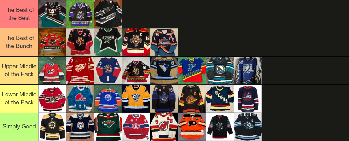
In anticipation of the new league-wide jersey program, I’ve chosen and tiered each active NHL team’s best jersey of all time.
In partnership with Fanatics, the NHL is creating one limited-edition alternate jersey for each team called the “Hometown Remix.” It’ll lean into city culture and history, similar to MLB’s City Connect jerseys. The last NHL-wide jersey program was Reverse Retro 2.0 during the 2022-23 season.
To understand the bar each team has to surpass, I researched every single jersey ever worn by present day NHL teams. After selecting the best for each team I created four tiers of eight jerseys: “the best of the bunch”, “the upper middle of the pack”, “the lower middle of the pack” and “simply good.” I gave each tier eight jerseys max so there’d be parity; there’d be one tier of fourteen jerseys if I didn’t.
I selected the top three from “the best of the bunch” for one top “best of the best” tier.
Some notes before we start:
Jerseys in the bottom tiers aren’t bad; I just like the ones in the higher tiers more. Every single one of these jerseys is excellent.
The jerseys aren't ranked in any way other than tiers, meaning a jersey isn't ranked higher than the one to its right. If they're in the same tier, they're equal.
I only counted jerseys that the present-day team wore. For example, Atlanta Thrasher jerseys didn't count for the Winnipeg Jets because they're irrelevant to the present-day team. The Quebec Nordiques count for the Colorado Avalanche since they wore the Nordiques jersey this prior season.
This list is entirely opinionated and for fun! I'd love to hear more opinions on both the chosen jerseys and their selected tiers!
Simply Good: Boston Bruins, Columbus Blue Jackets, Minnesota Wild, Montreal Canadiens, New Jersey Devils, Philadelphia Flyers, Seattle Kraken, Utah Mammoth
These jerseys are as titled, simply good. They don’t set themselves apart with anything unique; they’re simple yet clean.
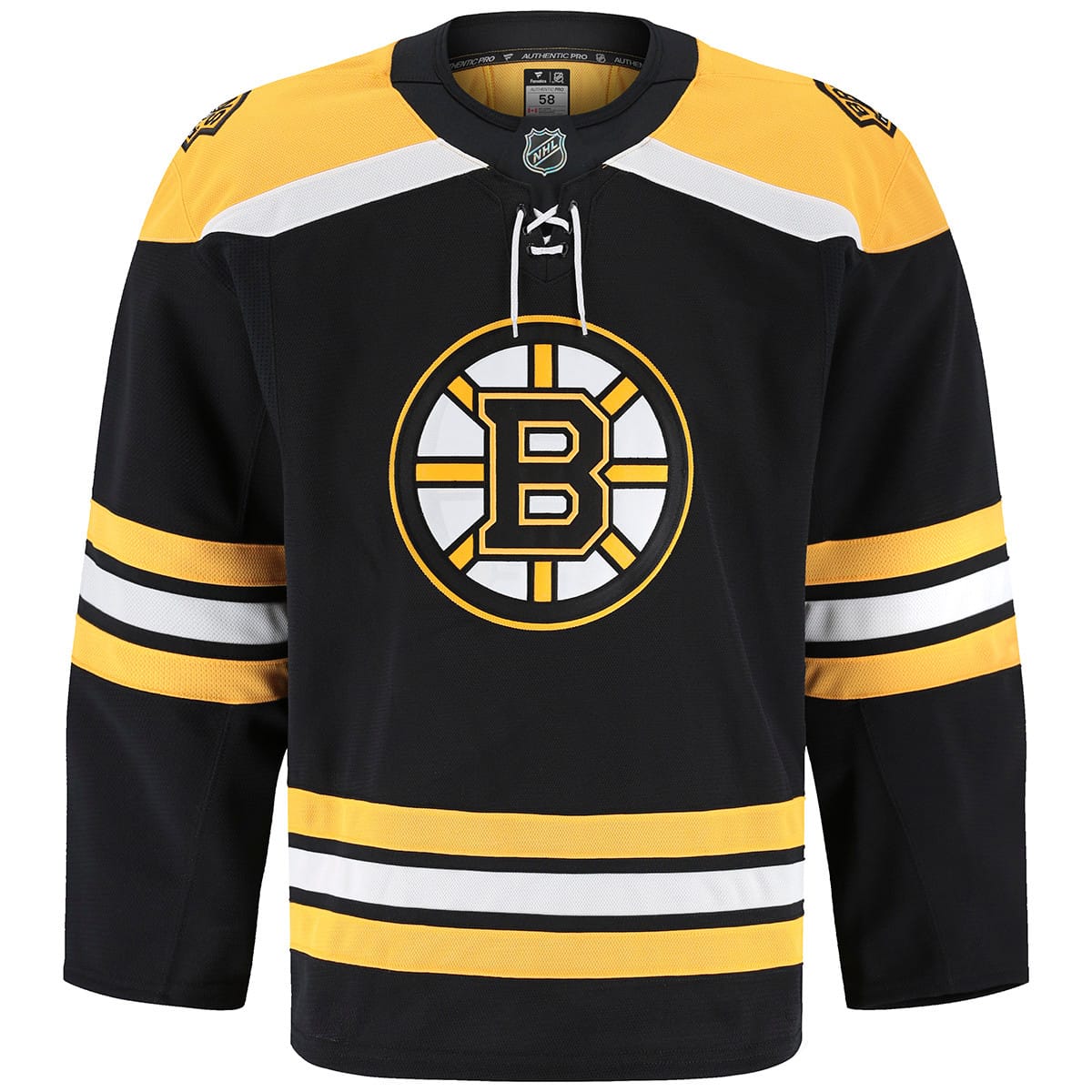
For Boston, I chose their previous black home jersey. Of the Original Six franchises, the Bruins have the deepest jersey history. They’ve had multiple templates and logos over the years, but eventually I settled on this. In comparison to their current homes, I favor the logo, the yellow shoulders and the smaller yellow stripes. I prefer this over any of their specialty jerseys because the striping isn’t as busy. I favor its sleek look over jerseys with stripes all over the sleeves. Being a classic home jersey, this felt like the correct tier.
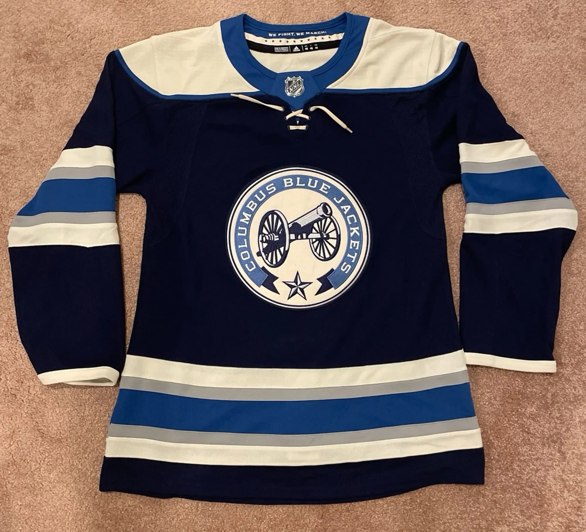
For Columbus, I chose their current navy-blue alternate jersey. The runner-up was their inaugural home jersey, but their cannon logo is one of the best in the league; I couldn’t choose against it. This one was just cut off from the next tier due to personal taste. I’m not a fan of the navy blue and cool blue combination, so I prefer the eight jerseys I have in the following tier. The striping pattern is still clean, though. I can admit this is a damn good jersey.
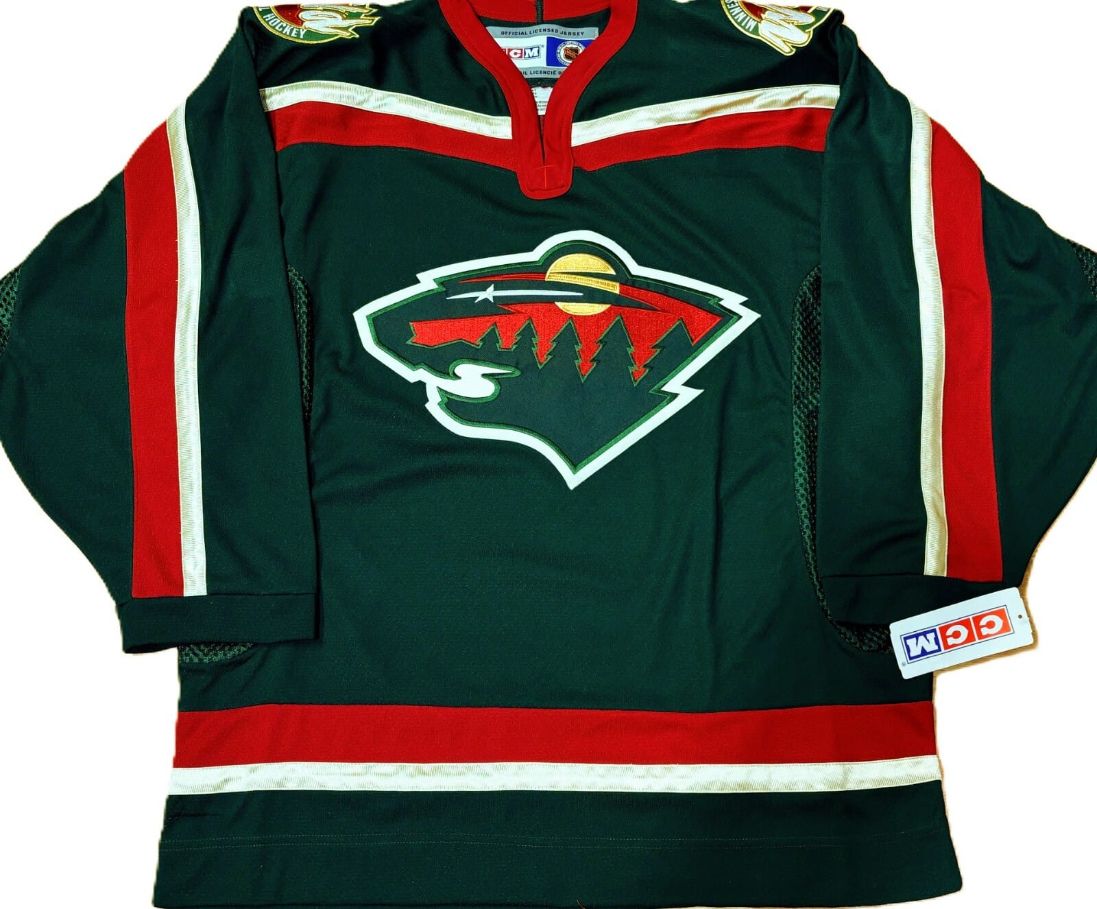
For Minnesota, I chose their inaugural green home jersey. I didn’t have any real favorites; I chose between any jersey with their main logo. A desert that’s simultaneously a bear head is truly impeccable, and I favor their inaugural jersey design above all. Simple collar stripes that continue down the arm are classic, and the navy green/red/cream combination can make anything look satisfying. Just like Boston, this being a simple home jersey lands them in simply good.
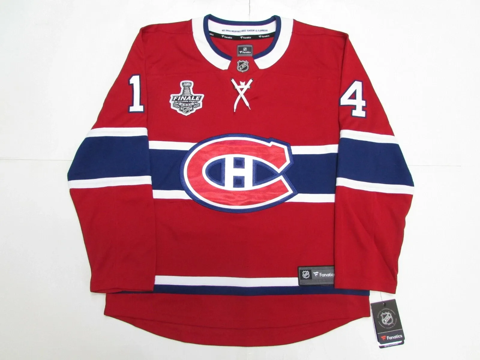
For Montreal, I chose their current red home jersey. It would’ve simply felt wrong to choose a blue Canadiens jersey for this list. The Canadiens have had the same jersey forever, literally forever. Some tiny changes here and there to make the jersey modern, but it’s always been the same blue/white stripes across the chest and arms. Even their reverse retros have the same striping, just inverted colors. It’ll forever be a timeless template, but it lands them in the simply good tier.
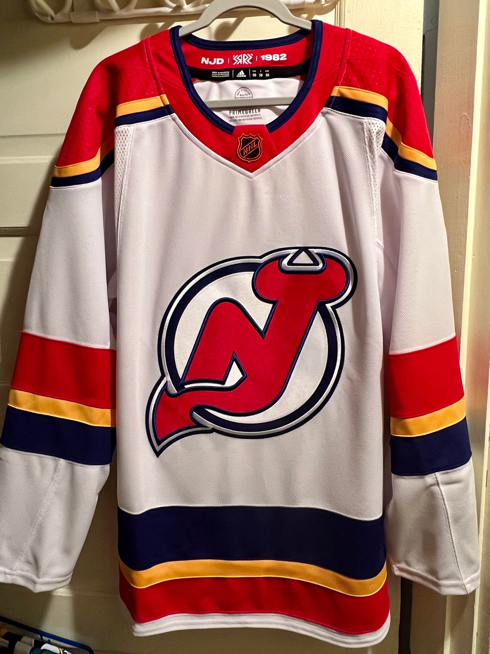
For New Jersey, I chose their 2023 reverse retro jersey. New Jersey has the dullest jersey history in the NHL. Just like Minnesota, nothing really stood out to me. Their current jersey set is bland, the striping being solely achromatic is dull. The green in their inaugural jerseys looks out of place, and their “Jersey” jersey was just plain stupidity. I settled on their 2023 reverse retro, the only white jersey in this entire list. The blue Kansas City Scouts jersey was probably the franchise’s best jersey, so for New Jersey this felt like the right choice. Their modern colors mesh well with the blue and yellow; it’s a clean look and a nice jersey.
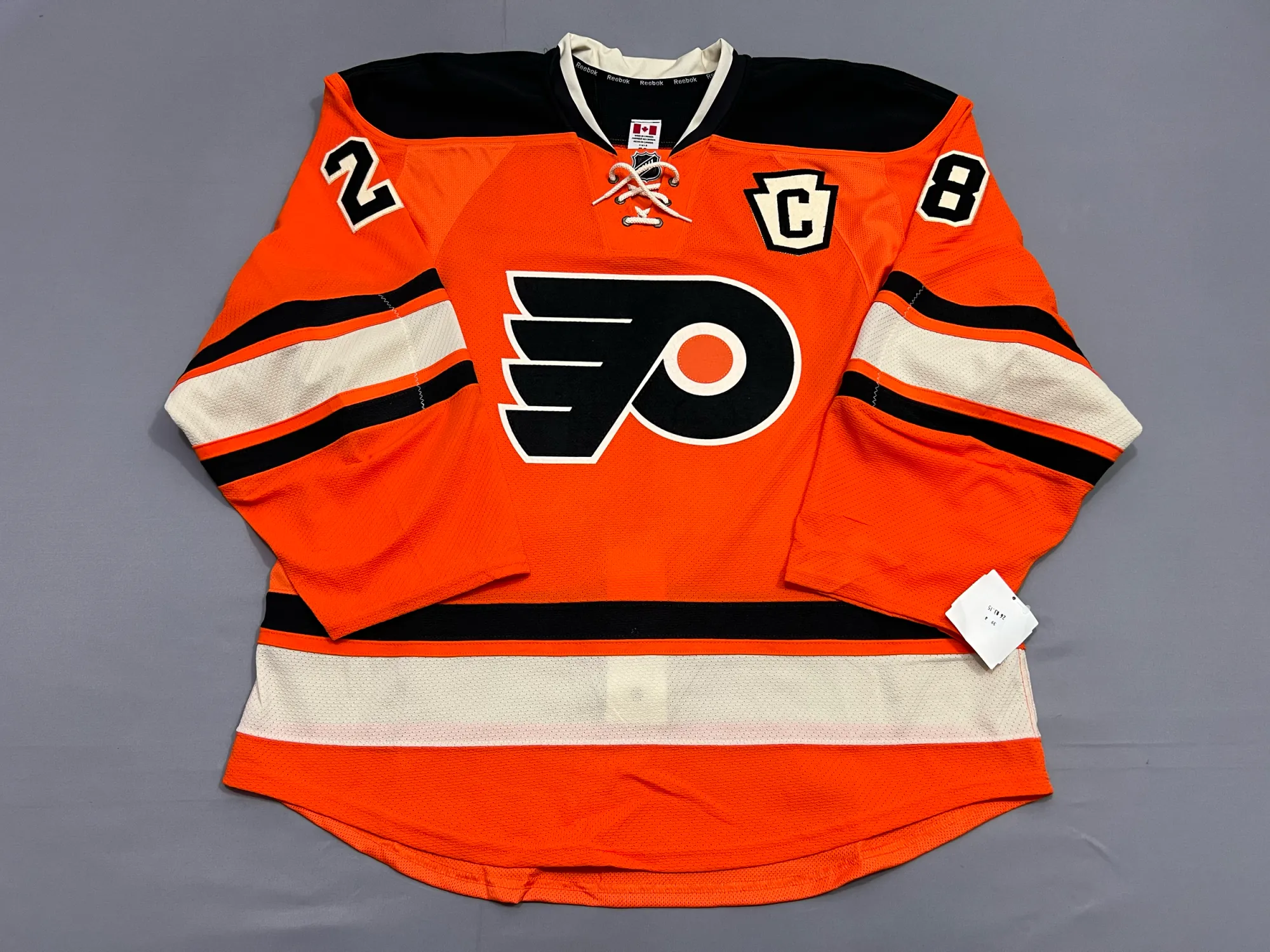
For Philadelphia, I chose their orange 2012 winter classic jersey. Just like Montreal, the Flyers have been using the same template forever. The color of the shoulder continues through the arm and ends as one big stripe. I’m not a fan of that design, but I can admit it’s objectively good. I felt it was best used in their 2021 reverse retro, which was my runner up before I chose their winter classic. It’s a simple striping pattern that is made clean with the combination of cream and orange. There being no bottom black stripe on the hem is weird to me. I think it would’ve looked better if it were identical to the sleeve striping, but it’s still a clean look. Nothing more or less, it’s simply good.
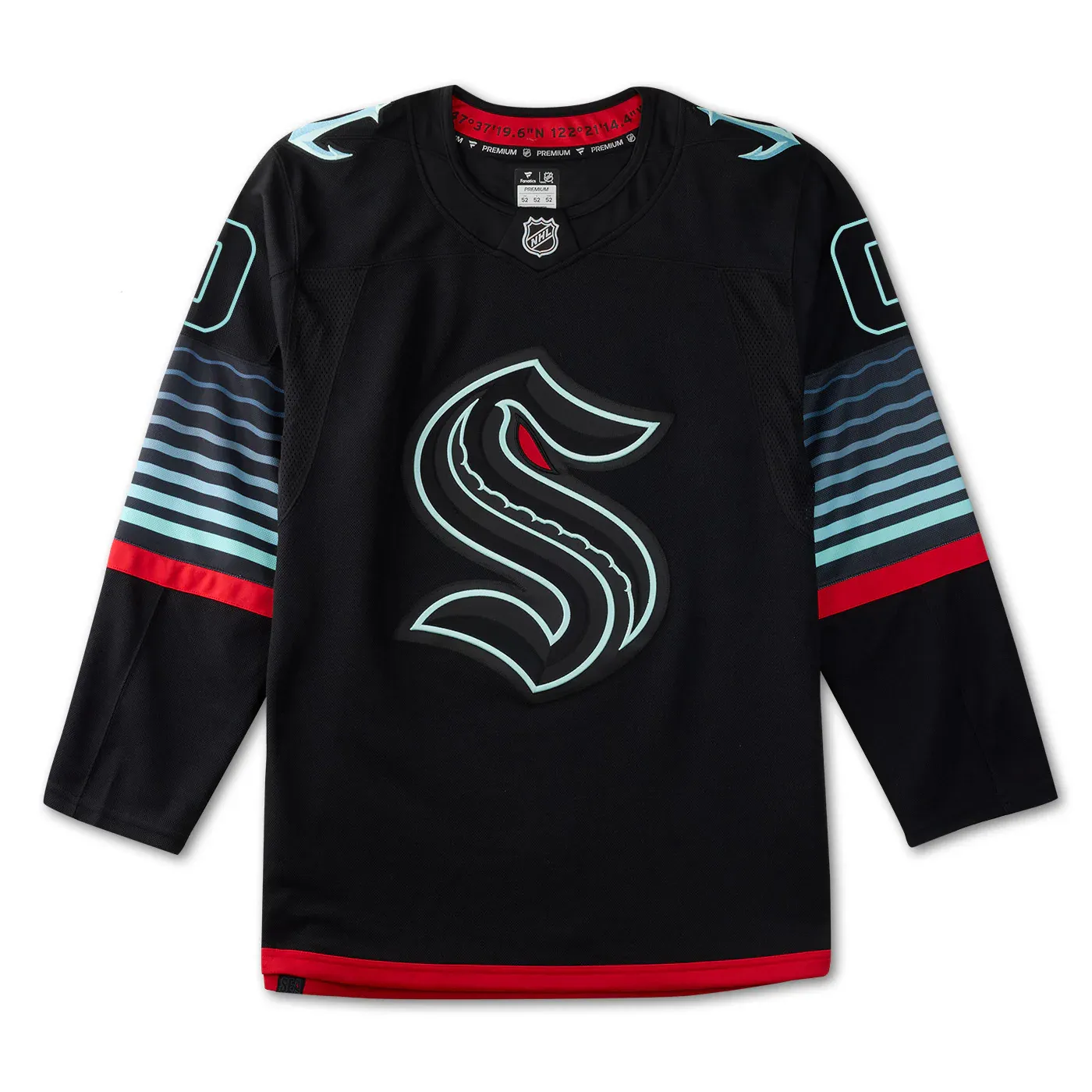
For Seattle, I chose their glow-in-the-dark alternate jersey. I’m in love with jerseys that glow-in-the-dark, so this felt like a no brainer. The jersey itself is black with gradient teal stripes on the arms. The numbers and logo are black with a teal trim for a blackout theme. It features a red hem trim, a red stripe below the gradient arm stripes and a red eye on the Kraken logo itself. When the lighting is right, the teal and red illuminate for an incredible effect that gives you a deep water feel. The inner collar features the coordinates of the Climate Pledge Arena, a fun Easter egg. This jersey is a perfect fit for the Kraken, but it doesn’t look nearly as cool in regular lighting. It’s still a sleek jersey regardless.
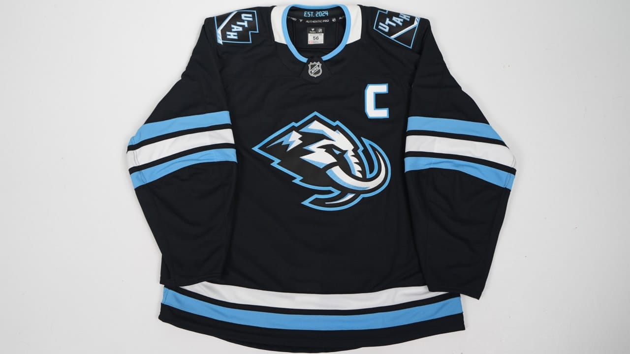
For Utah, I chose their current black home jersey. I’ll always choose a colored jersey over a white jersey, and those were my only two options. The light blue is a good look with the black base and the striping is classic. The logo simultaneously being a mammoth and snow mountains is really cool. They took a page out of Minnesota’s book and it’s excellent. There’s not much more to say about it; it’s a regular home jersey, and that’s why it’s in this tier.
Lower Middle of the Pack: Chicago Blackhawks, Colorado Avalanche, Edmonton Oilers, Nashville Predators, Toronto Maple Leafs, Vancouver Canucks, Vegas Golden Knights, Winnipeg Jets
These jerseys are too creative to be simply good, but they don’t quite stand out from the rest either.
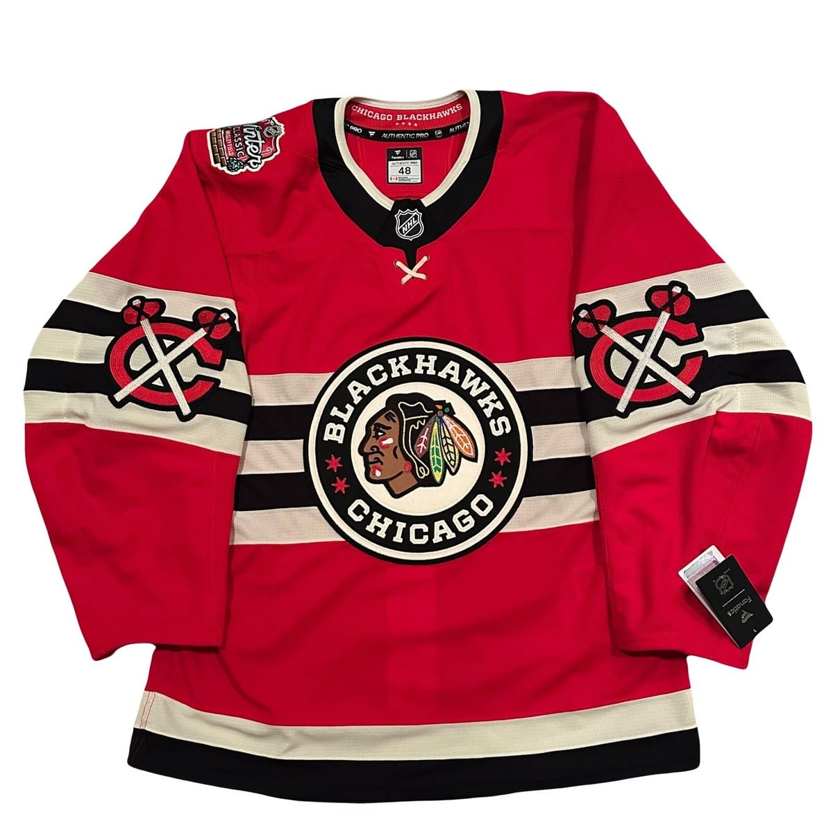
For Chicago, I chose their 2025 red winter classic jersey. This one is beautiful; it’s only in this tier because I had to make a cutoff. It’s an even better version of their 2009 winter classic jersey. In my opinion, the Blackhawks have the best logo in the NHL. The stitching of the colorful feathers is beautiful to see in person, I’m in love with every variation of it. Along with that, I love the stars around the crest for Chicago, the pinstripe numbers for the Cubs, the cream striping and the elbow logos. It’s all creative and well done.
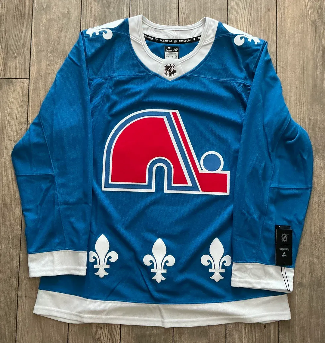
For Colorado, I chose their blue Nordiques jersey. The Avalanche have a shallow jersey history. They have good home/away sets, but their alternates and stadium series were just alright. Along with that, they got unlucky with both reverse retros being white. The Nordiques jersey felt like the obvious choice. The powder blue fits this logo so much better than the Avs’ maroon. A single season return for a jersey we haven’t seen in 30 years felt too special to put in the bottom tier, especially with how beautiful it is. An iconic logo with the fleur-de-lis lining the bottom, it’s hard to beat this classic.
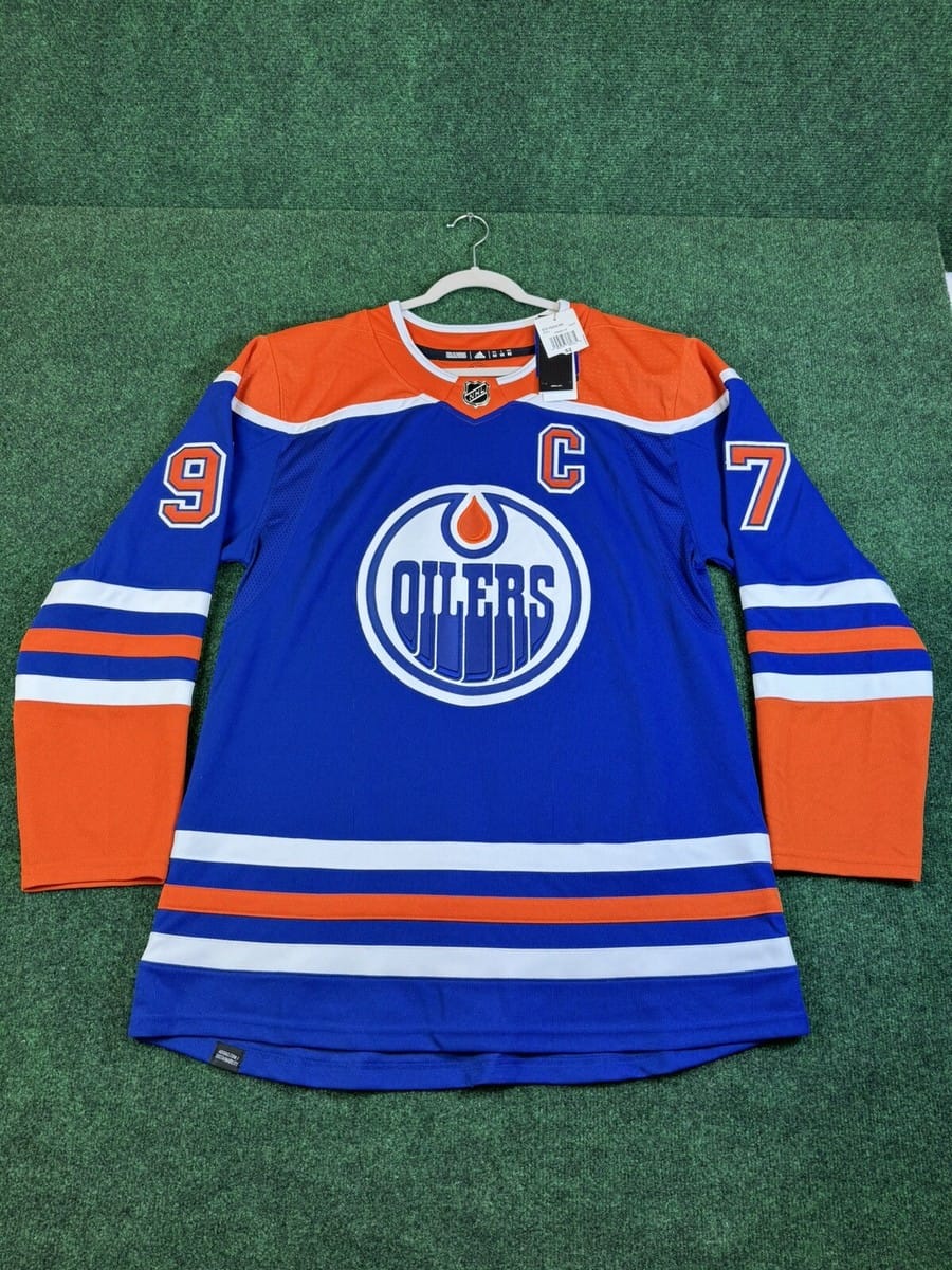
For Edmonton, I chose their blue home jersey. Another team with a shallow jersey history, I can count on one hand how many good jerseys they’ve ever had. I didn’t like any of their specialty jerseys enough to justify choosing something else; the runner up was their 2023 heritage classic. The number being inside the oil drop is legendary, but the striping itself isn’t the best. In my opinion, the Oilers have the best home template in the NHL. That’s why I have it one tier above the other home jerseys. I don’t think there’s a better striping pattern out there, and it’s supported with a wonderful color palette.
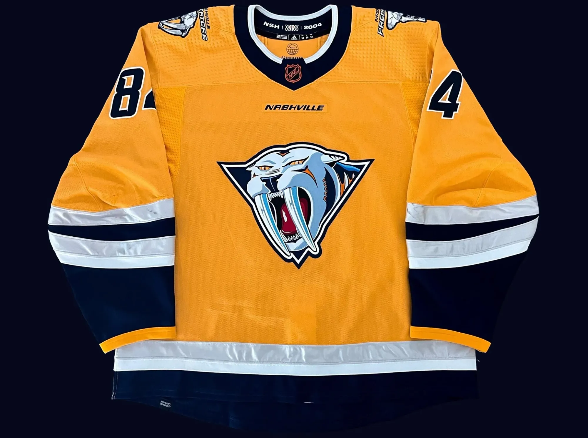
For Nashville, I chose their 2023 reverse retro. However shallow Edmonton’s jersey history is, Nashville’s is worse. The logo and template on this jersey are easily their best; it’s why it’s in this tier. It’s a throwback to their first alternate jersey in the 2000s, featuring the same logo and striping. The only difference is it doesn’t use the original ugly mustard yellow; it uses their modern and vibrant yellow. It’s a revamped version of the original that fixed its only issue.
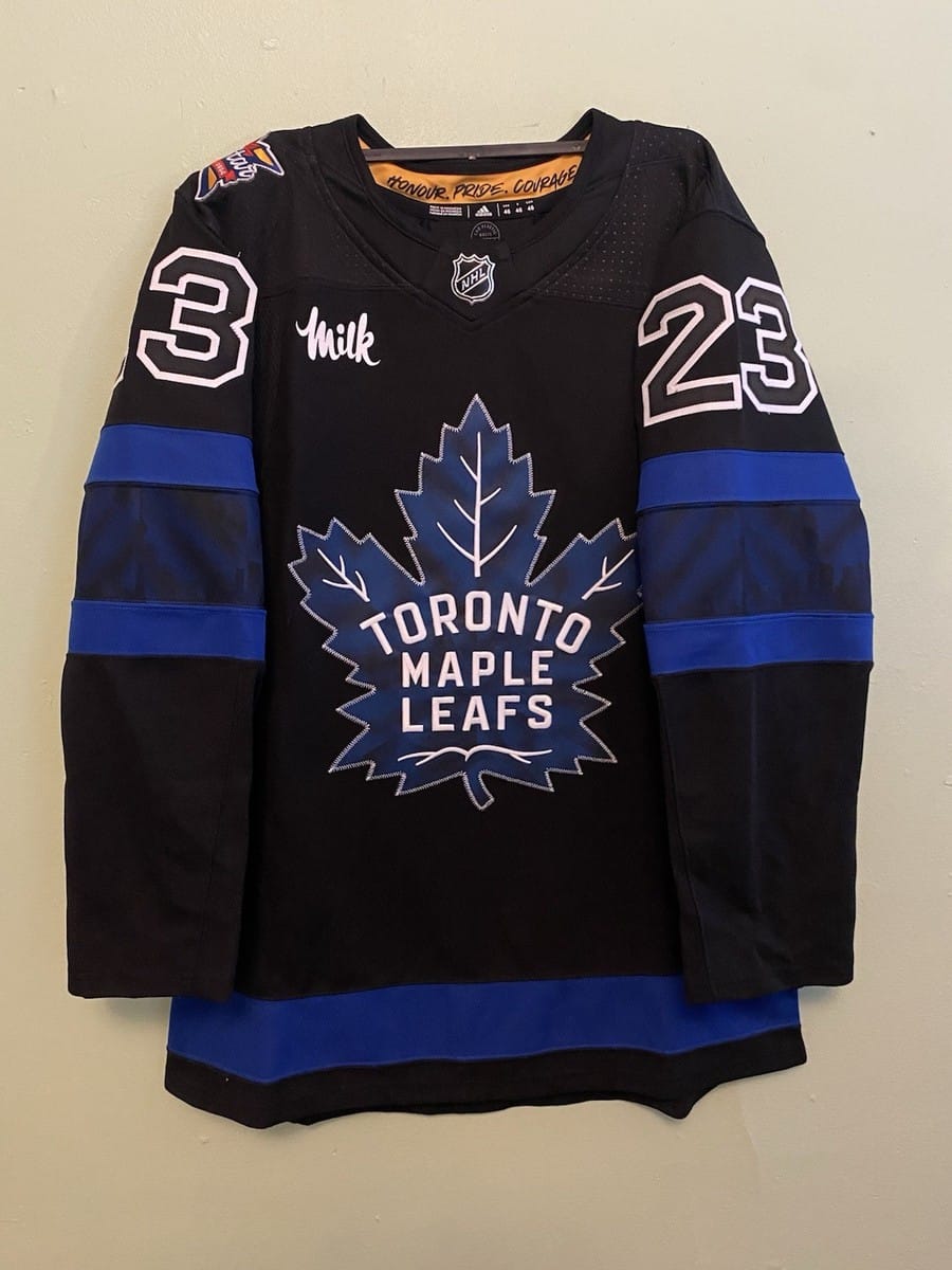
For Toronto, I chose their current black alternate jersey. The Leafs have made blue and white work in multiple ways throughout their existence. They also made pretty cool reverse retros. Eventually I settled on their current alternate as it was something entirely new. Black and blue will always work, and the Toronto skyline within the arm stripe is a sick touch. This jersey also featured a yellow side if worn inside-out, a fun Easter egg. It’s a really creative jersey, and I’m happy to see Toronto use a color they never had before.
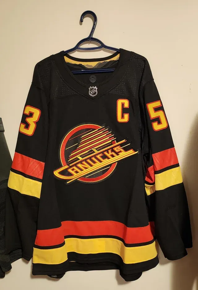
For Vancouver, I chose their black flying skate jersey. Don’t ask about the flying V; it’s an abomination. The gradient is an abomination as well. The Canucks’ attempts at creativity were pretty big fails; their best jerseys came from simplicity. My runner up was just their current home jersey, the teal and green is my favorite combination in the league. It’s just impossible to choose against the flying skate; it’s an elite logo that’s better than simply good.
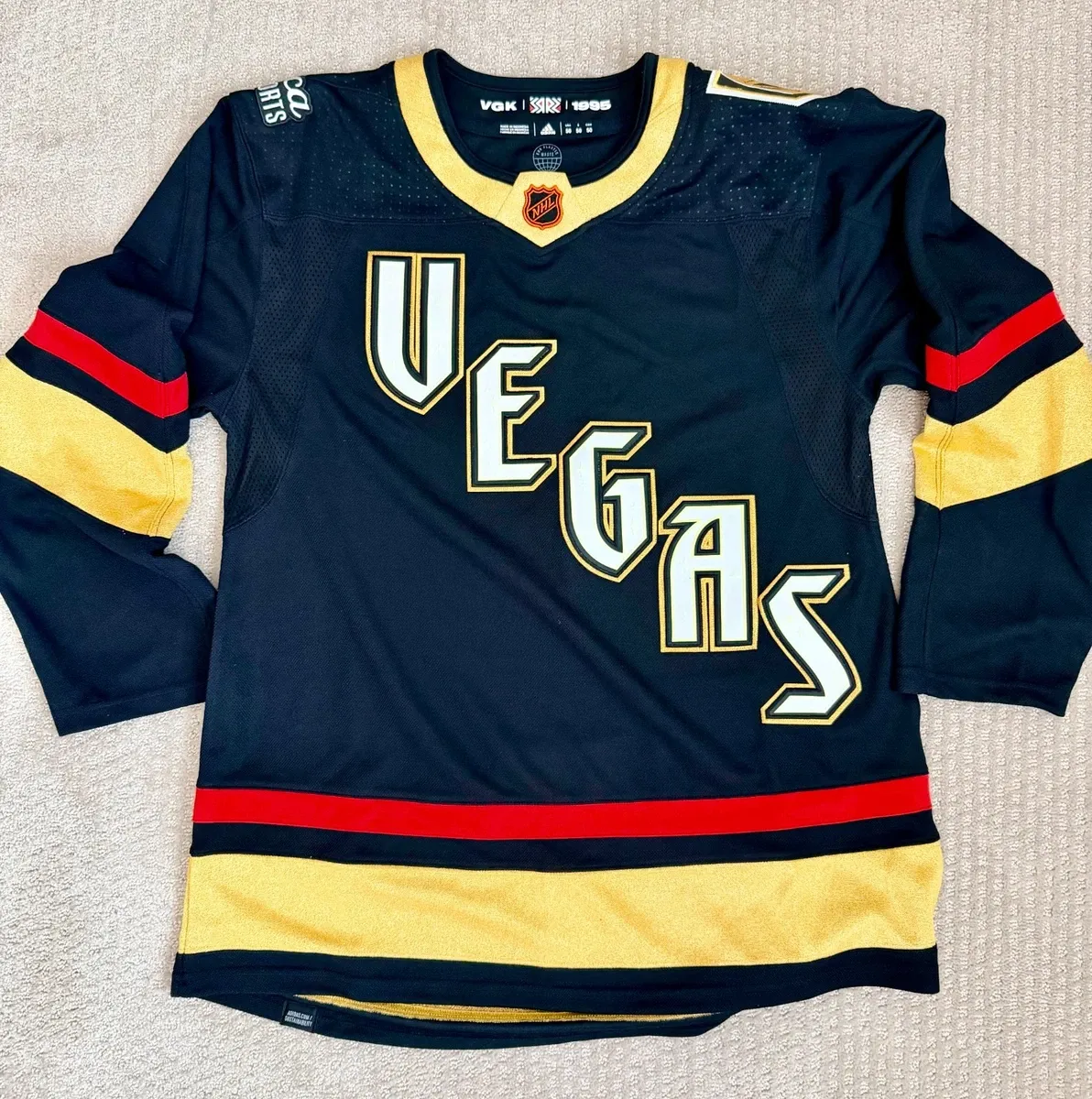
For Vegas, I chose their 2023 black reverse retro jersey. Another glow-in-the-dark jersey, this one is above Seattle because it’s designed better. It looks just as good in light as it does in the dark. Red is underutilized by Vegas; it mixes perfectly with their sparkly gold. It features a gothic wordmark with hidden medieval designs that glow in the dark. It fits the vibe of a knight perfectly and creatively. I hadn’t considered any other jersey for Vegas.
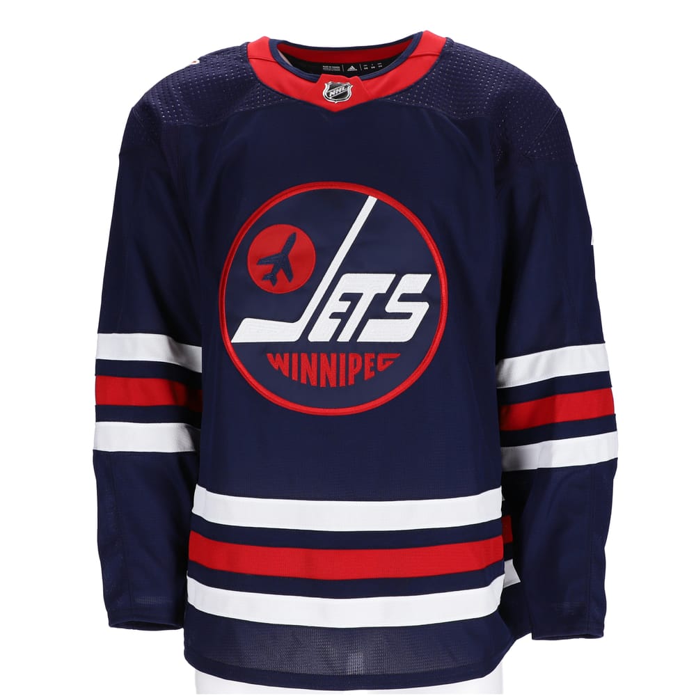
For Winnipeg, I chose their navy-blue heritage jersey. I originally chose Atlanta’s navy-blue alternate, but it felt unfair as it never represented the Winnipeg Jets. Only looking at Winnipeg, I felt their heritage jersey was a no brainer. Almost every specialty jersey used their throwback logo, and the navy-blue base made it look its best. Their former powder blue alternate was actually pretty clean, but it doesn’t compare to the throwback logo. It features “Winnipeg Jets” in a bubbly aerial font with the J being a hockey stick. Next to the J is a jet inside of a puck, little fun Easter eggs that are designed with the perfect balance of blue and red.
Upper Middle of the Pack: Carolina Hurricanes, Detroit Red Wings, New York Rangers, Ottawa Senators, Pittsburgh Penguins, St. Louis Blues, San Jose Sharks, Tampa Bay Lightning
These jerseys are all excellent, but just not quite a part of the top eight.
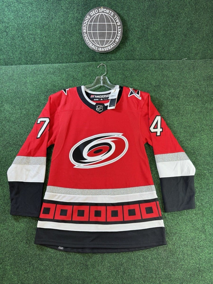
For Carolina, I chose their red 25th anniversary jersey. The Hurricanes’ jersey history is nothing short of abysmal. They debuted with perfect jerseys and have done nothing but downgrade since. The runner-up was their gray Hartford Whalers jersey; I didn’t consider any other Hurricanes-designed jersey. It’s in this tier because I’m in love with the storm warning striping. It’s satisfying and unique to the Hurricanes, no other team can utilize this pattern. It was its best in 2023; the red squares were in perfect contrast with their black background. The warning is also featured on the shoulder patches. The sparkling silver trim of its color-balanced striping is the perfect touch. This jersey is nothing short of beautiful and it’s a crime that it’s not in use.
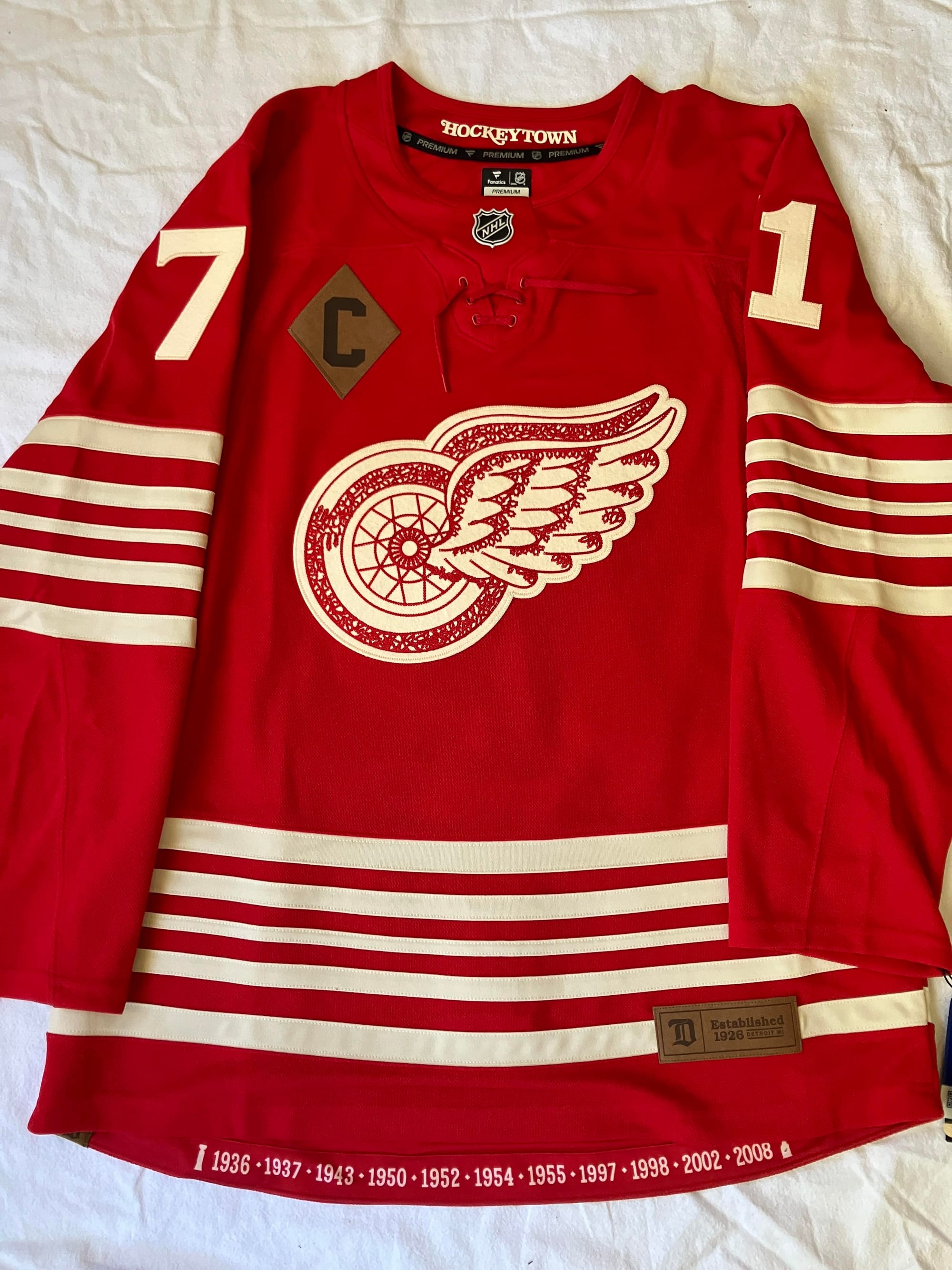
For Detroit, I chose their red centennial jersey. This jersey saved Detroit’s ranking; every other jersey is either bland or disgusting. The striping is a throwback to the Detroit Falcons of the 1930s, using a dirtier white to give it a vintage feel. The leather patches are a throwback to players using leather gloves and pads. Finally, this logo is one of the greatest ever used on a hockey jersey. The wheel is iconic, and the stitching within is simply beautiful. It’s a chained stitching pattern used as a throwback to the creation of the logo in 1932. It’s the perfect blend of vintage and innovative.
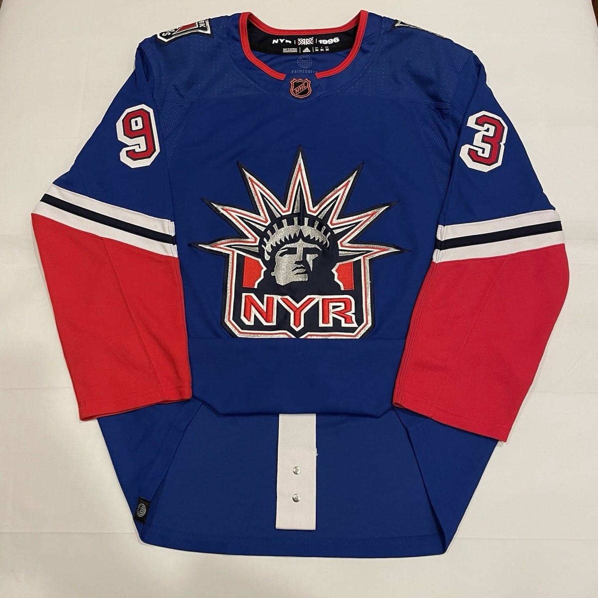
For the New York Rangers, I chose their blue 2023 reverse retro. The Lady Liberty was an easy choice. I only had difficulty choosing the original or the ranger blue. I eventually settled on the ranger blue because of its vibrance. I didn’t consider the 2021 reverse retro since there was barely any striping. The red on the sleeves makes the color balance perfect. The Statue of Liberty is New York’s most iconic landmark; slapping it on the sweater was the best decision the Rangers made. This is one of the NHL’s most iconic logos.
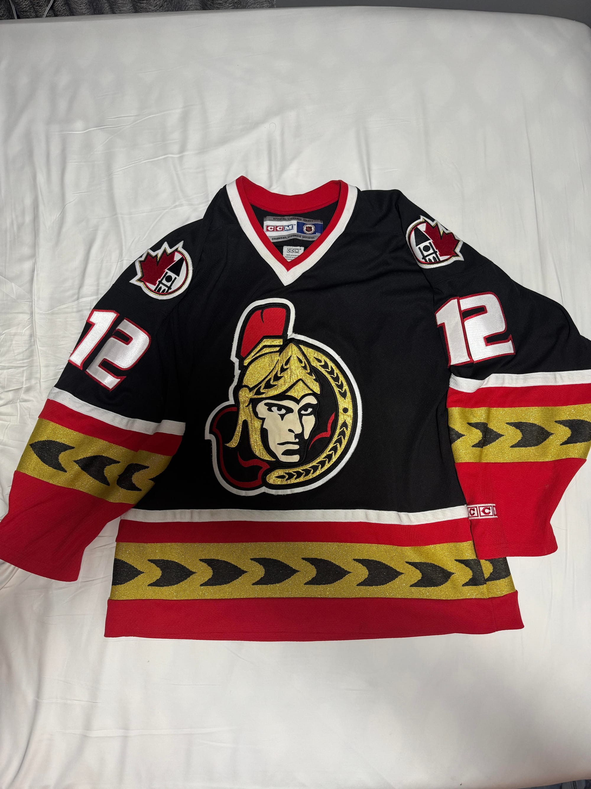
For Ottawa, I chose their 2000s black alternate jersey. I know the barber pole is a fan favorite, but the logo’s wings for striping are one of my favorite details from any jersey. It’s not as special as Carolina’s storm warning, but it’s still sleek and unique to Ottawa. Also unique to Ottawa is Canada’s Parliament, featured on the shoulder patches. You’ll start to notice the jerseys in this tier and above have a lot of color on the sleeves and hem. The red striping around the sparkling gold gives the sweater a perfect balance of black and color. The front-facing senator is also my favorite Ottawa logo.
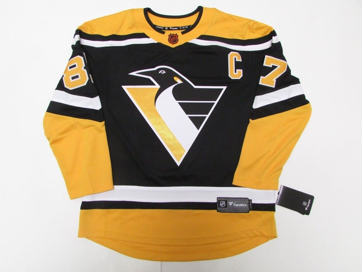
For Pittsburgh, I chose their black 2023 reverse retro. I had the most difficulty choosing a Penguins jersey. I was stuck between the original robopen, their 2008 winter classic, their 2021 reverse retro, their current home and their 2000s home. The Penguins have one of the best jersey histories in the NHL. I decided to choose a robopen jersey for the logo; it’s my personal favorite from Pittsburgh. I chose the 2023 reverse retro because its simple striping complements the logo better than the original jersey. The different striping patterns from the 2000s were really cool, but the reverse retro just objectively looks better. The logo was made to be sleek; it needed a simple template.
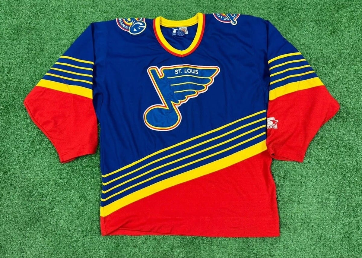
For St. Louis, I chose their blue retro jersey. This was an easy choice, no other Blues jersey was this unique. The sleeves having yellow piping lead to red is a beautiful design. The same design being on the hem makes the vibrant colors perfectly balanced. The back numbers not overlapping with the hem striping makes it satisfying from all angles. The trumpet shoulder patch and the music note logo are perfect callbacks to the city’s jazz history. This jersey is a stunning classic.
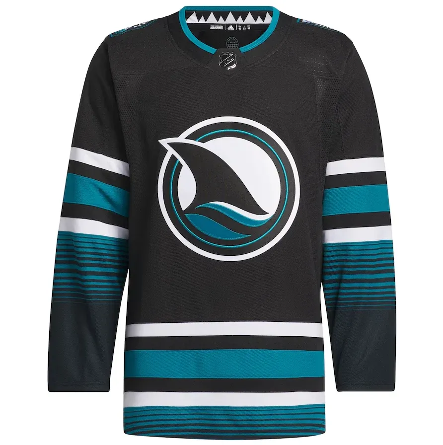
For San Jose, I chose their black fin jersey. Another team with a rich jersey history, their colors make anything look good. The runner up was their 35th anniversary jersey, but I ended up choosing the fin because of the details within its striping. The unique pattern is meant to replicate yarn-dyed textiles, the process of dyeing yarn before weaving. The patterns created from this process are deep-rooted in Hispanic culture, a beautiful detail for San Jose’s Hispanic population. The logo itself only features a shark’s fin, a simplistic yet clean look. The shoulder patches feature San Jose highlighted on a map of California surrounded by the word mark “Northern California.” It’s a sleek and wonderful look that embodies the culture of San Jose.
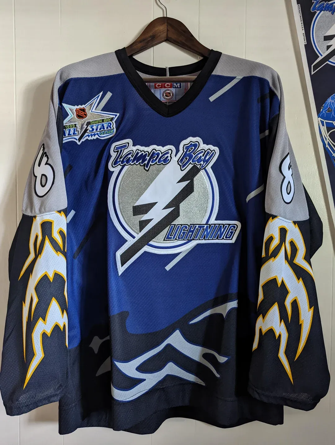
For Tampa, I chose their blue storm alternate. It was either this or their inaugural home jersey, the logo is the team’s best. The team’s wordmark is featured in an aggressive font, perfect for the vibe of a lightning storm. The lightning bolt itself celebrated Florida as the lightning capital of America. Choosing this jersey is probably my hottest take. Many people think the storm patterns simply don’t look good, but I couldn’t disagree more. The yellow lightning gives the electric feel of a storm without clashing with the blue and gray. The water represents the flood of a storm whilst looking good as dark blue on lighter blue. Both blues are used as rain on the entirety of the jersey’s front, crashing towards the hem and worsening the flood. Representing a literal lightning storm as the Tampa Bay Lightning is the coolest thing they’ve ever done, and I don’t think it looks ugly whatsoever. This was the final cut-off for the best of the bunch.
Best of the Bunch: Buffalo Sabres, Calgary Flames, Dallas Stars, Florida Panthers, New York Islanders
These five jerseys separate themselves from the rest. They’re the best of the entire list, just not a part of the top three.
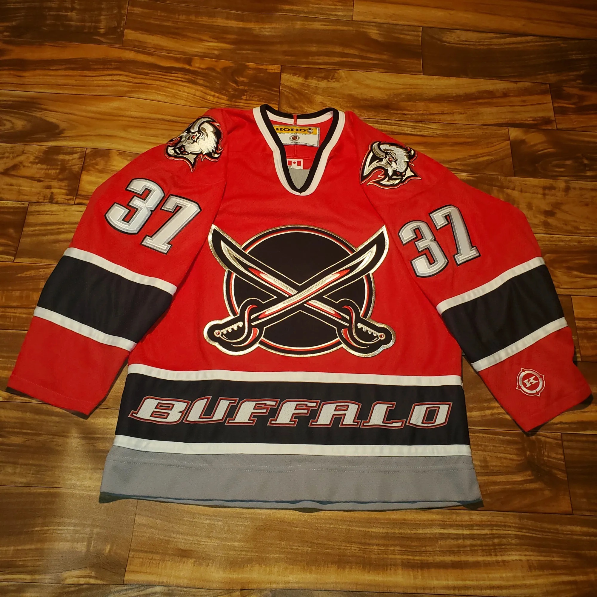
For Buffalo, I chose their red sword alternate. The goat head is the fan favorite, but I couldn’t choose against this jersey for one reason. The wordmark on the hem stripe is my favorite design choice of all time. It’s the cleanest way to rep your city without using your logo. This jersey features a simple striping design that’s elevated by that one detail. This jersey was unique for the Sabres because of its color and logo. The red base was only ever seen on this jersey, a vibrant and aggressive look that captures the vibe of a buffalo. The silver, black and white striping combine beautifully with this base. The logo was only ever seen here and on the 2021 reverse retro. Two sabers crossed to symbolize competitive spirit, a sleek way to represent the team itself. The jersey’s colors shining off the sabers on the logo is another detail I love. The goat head is also featured on this jersey as the shoulder patches. This jersey is packed with details to make one of the best jerseys in NHL history.
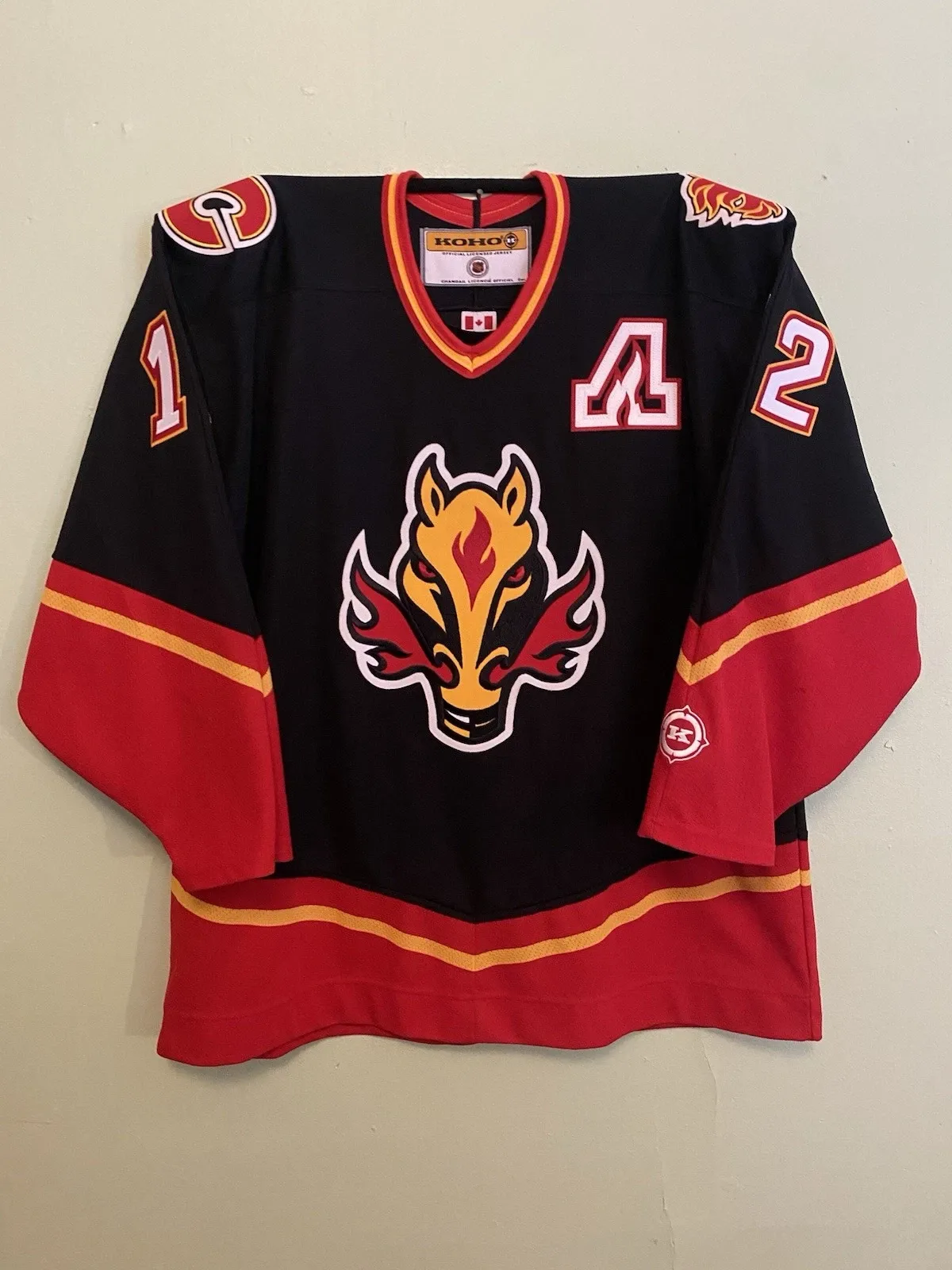
For Calgary, I chose their original blasty jersey. This was an easy choice. A fire-breathing stallion is fucking sick. I knew immediately it’d land in this tier. A shoutout to the Calgary Stampede and a homage to the city’s western history, this hit all the marks. The red flames and eyes give an aggressive look. The logo being mostly yellow is balanced by the striping being mostly red. The black base makes the colors stand out beautifully. The Flames made McDonald’s colors look as bad ass as possible, there’s a reason this jersey is an easy fan favorite.
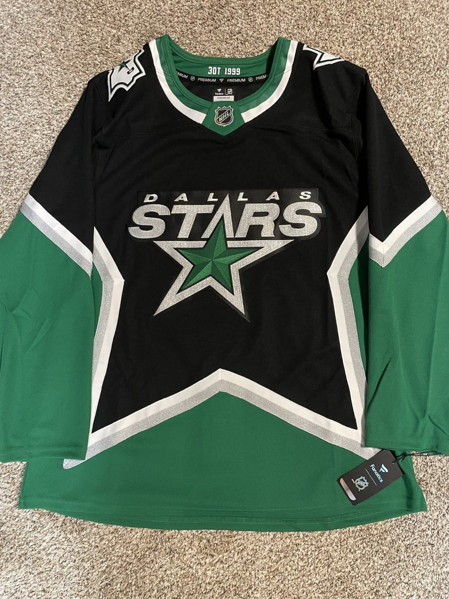
For Dallas, I chose their current black alternate. It was between this and their original star template; it’s a thing of beauty. I went with this because I think the lighter green and silver looks better than the darker green and gold. I also like the black base over the green base. The shading within the logo’s star to make it shine whilst the tip is the A in “STARS” is incredible. The entire logo being a sparkly silver to give it all a shine is an amazing call to cowboy culture. Making the jersey itself a star is one of the coolest templates of all time, and it makes the colors balanced perfectly. The inner-neck line features “1999 3OT” to shoutout the team’s only Stanley Cup victory. Wearing the star jersey, Dallas defeated Buffalo in triple overtime to win the 1999 Stanley Cup. It’s a beautiful throwback that revamped the original jersey to fit the team’s modern colors.
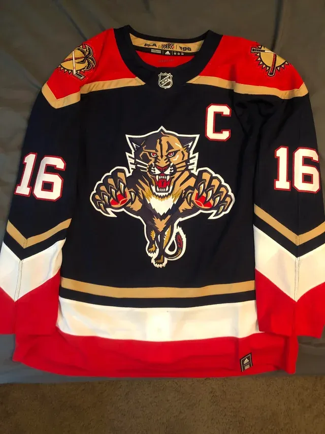
For Florida, I chose their navy blue 2021 reverse retro. This was their best logo; I don’t think it’s a conversation. The modern logo is clean, but this is bad ass. The panther is lunging towards you with sharp fangs and claws; it’s intense and I love it. It has red eyes, red paws and a red mouth to make it even more aggressive. The shoulder patch features a palm tree and a hockey stick crossed in front of the sun. It reminds you of sunny Florida whilst pushing a competitive vibe. The striping is colorful and balanced; it minimizes the gold of the panther to make its red and white pop. The Navy-blue base was the perfect choice for this color palette. It’s nothing short of an incredible jersey.
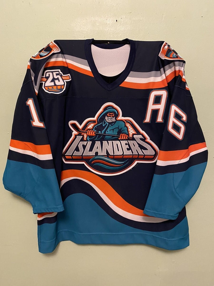
For the New York Islanders, I chose their original navy-blue fisherman jersey. Probably the most polarizing jersey of all time, people either despise it or love it. Personally, I love everything about it. I will die on the hill that this is an incredible logo. The fisherman has an intense look, grinding his teeth like a sailor battling the sea. In this instance, the sea is right below him. The sea blue hem striping being the wave the sailor is battling is an awesome touch; it meshes perfectly with the orange and navy blue. The “ISLANDERS” word mark serves as his boat, with a hockey net acting as his fishing net behind him. He’s holding a hockey stick to act as his fishing rod, with shoulder patches of a blaring lighthouse. It’s the perfect homage to Long Island’s maritime culture; it makes you feel like you’re at sea. Everything about this jersey is unique, clever and done beautifully.
Best of the Best: Anaheim Ducks, Los Angeles Kings, Washington Capitals
Finally, the best of the best. As the title insinuates, these are the best jerseys of all time.
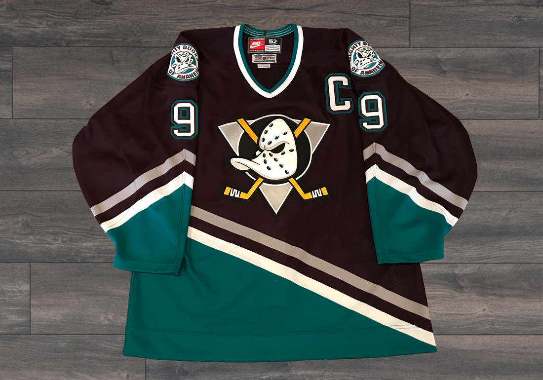
For Anaheim, I chose their eggplant mighty ducks jersey. A purple/maroon base featuring that iconic 90s mighty ducks logo. A goalie mask in the shape of a duck head with crossed hockey sticks to evoke battle, it’s timeless. The shoulder patches feature that same duck mask but front facing, that Disney feel the original team had. A silver and white stripe separates the eggplant from the deep teal hem, a unique jewel-tone combo that looks elegant. The diagonal striping makes it stand out from other hockey jerseys, and its consistency between the hem and sleeve makes it satisfying to look at. Bringing the Mighty Ducks to real life was nothing short of exciting, and this jersey is the perfect blend of nostalgia and style.
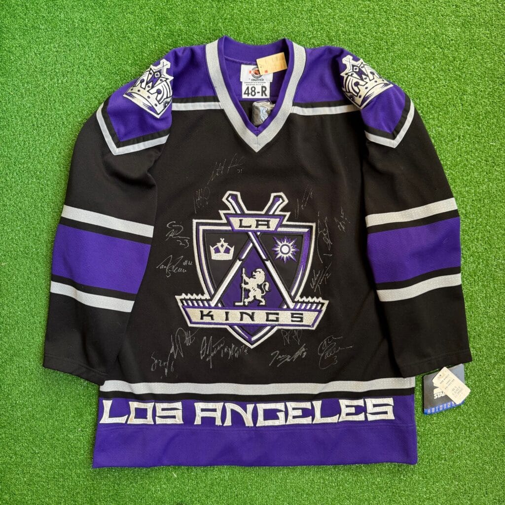
For LA, I chose their 2000s black shield jersey. Creating a 1-32 ranking of these jerseys would be impossible, but this jersey would easily be number one. This is my favorite hockey jersey ever. As previously mentioned, I love word marks on striping. The Kings hit the mark by putting “Los Angeles” over the purple hem. Purple and black alone are an incredible color palette, a majestic feel for a team of royalty. That majestic feel is seen in its unbelievably deep logo. At the base is a shield to symbolize the honor of a king. It’s then separated into three portions by crossed hockey sticks. The front and center portion is purple, and the two corner portions are black. Top left is a crown to symbolize a king’s authority. Top right is a sun to symbolize LA’s weather. Front and center is a lion to symbolize majesty and a fierce sense of competition. The dueling sticks are held together from the shafts by an “LA” letter mark. The blades of the sticks rest perfectly on a “KINGS” word mark. The lion of the shield is also standing on this word mark. The colors and symbols are all balanced perfectly to create the deepest logo in NHL history. This is a jersey fit for a king.
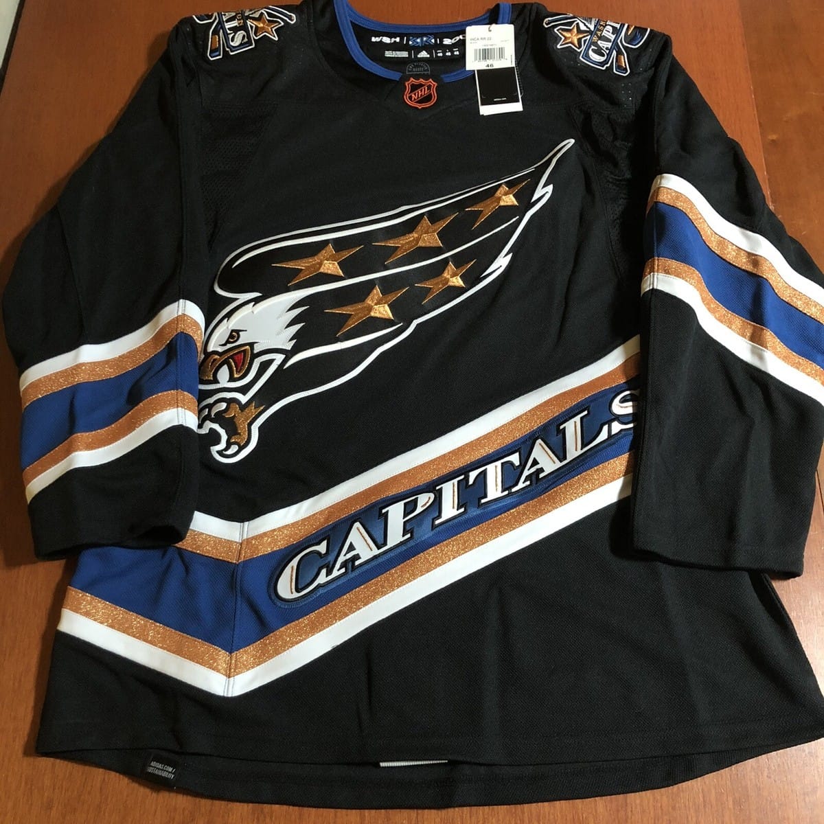
For Washington, I chose their black screaming eagle jersey. Originally made as a reverse retro, it was brought back for one final season as an alternate jersey. It was always going to be a screagle; I just had to choose black or blue. The blue is definitely more vibrant, but I think the black base fits the copper better. The copper itself is meant to symbolize American currency and liberty. The eagle is screaming with its claw out to represent ferocity. The symbolism within the logo is a perfect fit for the U.S.’s capital. The bird itself is, of course, a bald eagle to represent freedom. On its wings are five shiny copper stars to represent the flag of the U.S. You’ll notice three on top and two on bottom to symbolize a hockey lineup of three forwards and two defensemen. The striping of this jersey is made to match the angle of the eagle. It’s a unique diagonal pattern that doesn’t end at the bottom of the hem but bounces back up to continue around the jersey. It looks sleek and features a “CAPITALS” word mark. It’s a sharp font to match the eagle’s intensity and D.C.’s properness. The shoulder patches are another all-time great Capitals logo. Crossed sticks battling for a puck behind the Capitol Building, one of D.C.’s landmarks. This jersey is nothing short of legendary.